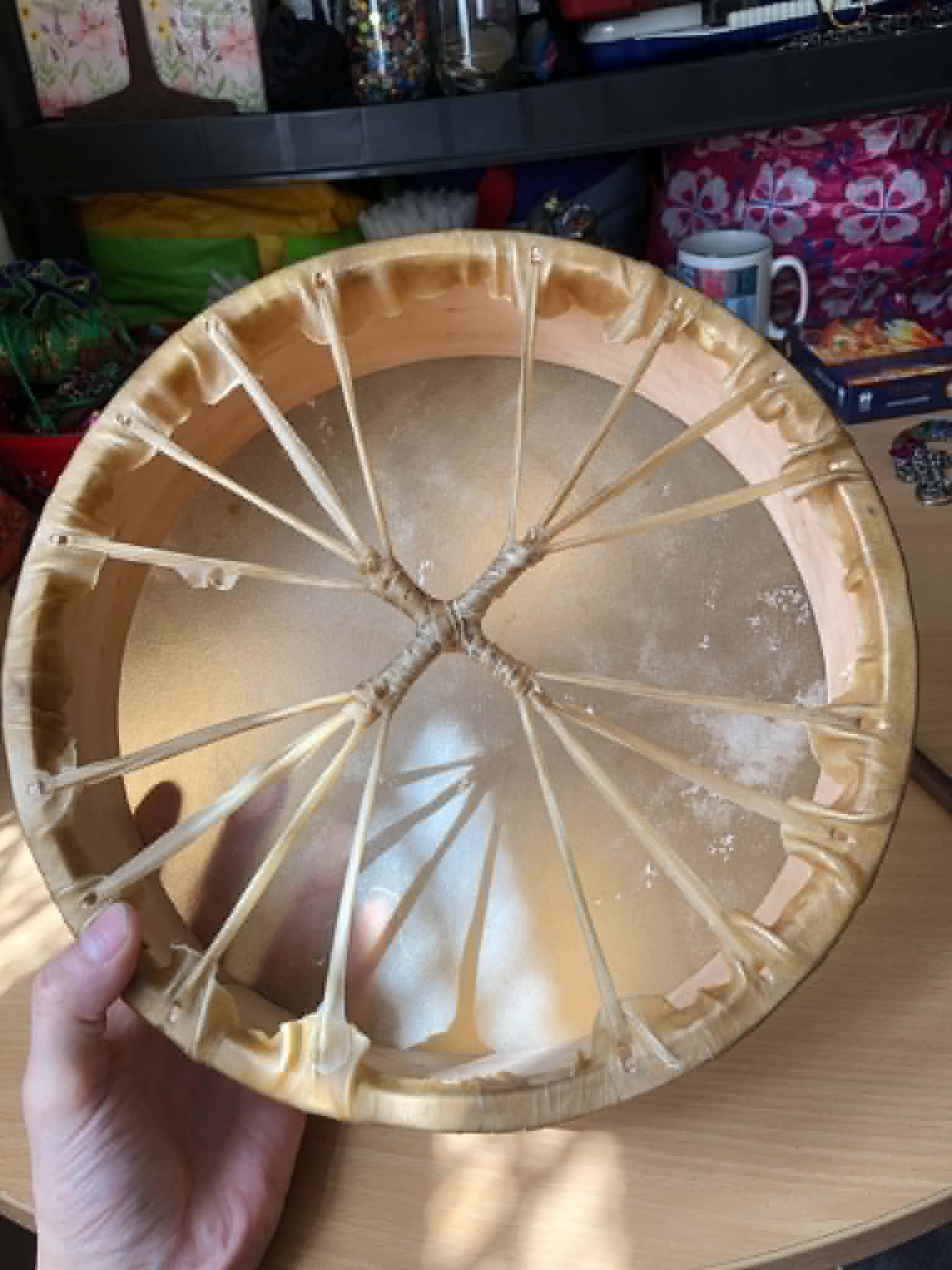
                     |
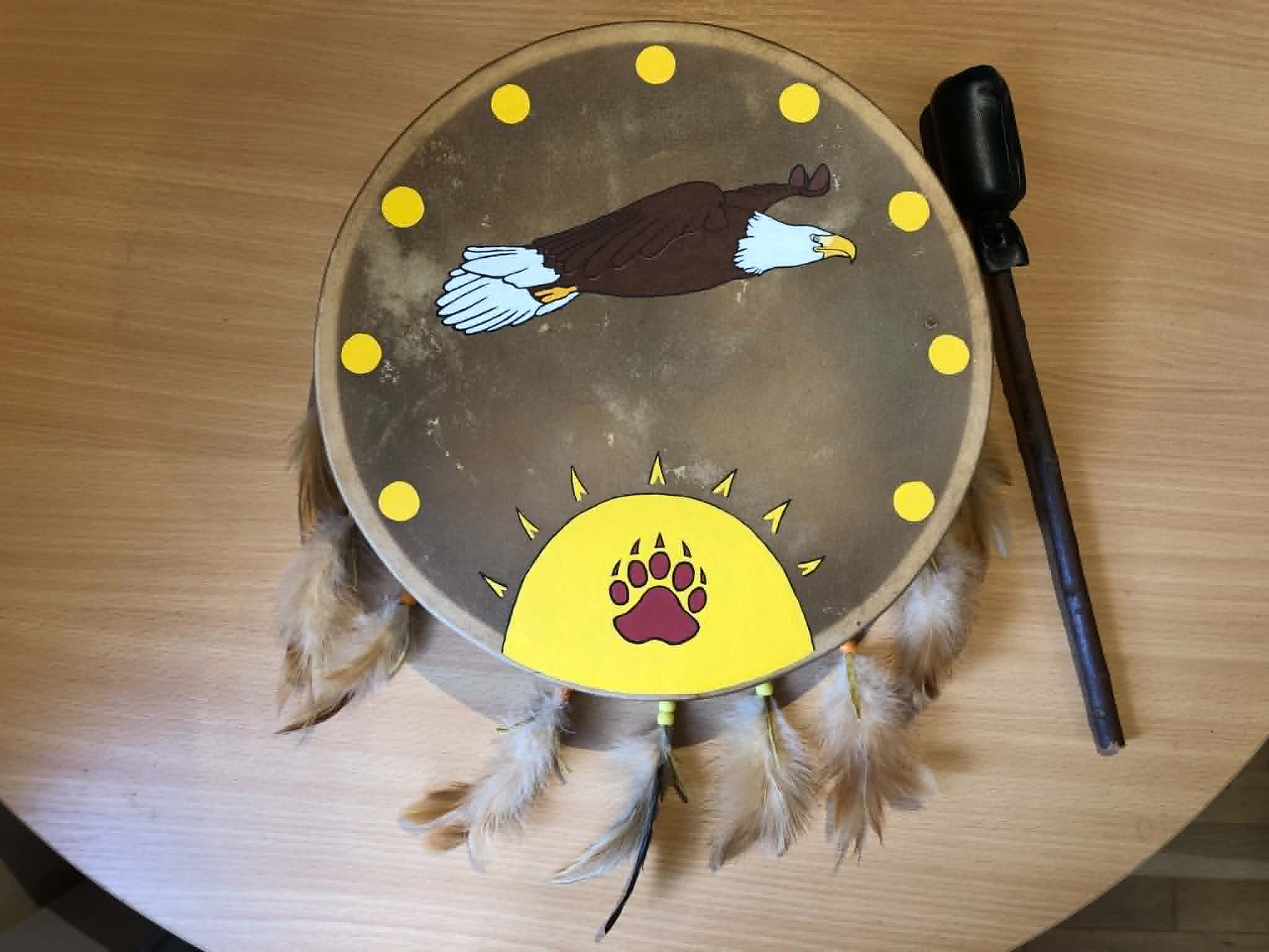
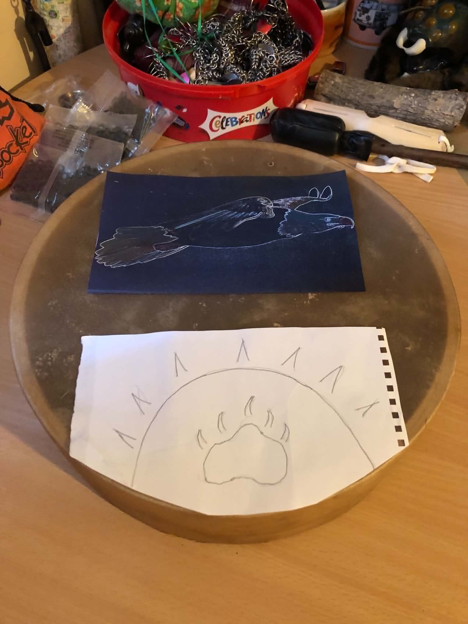
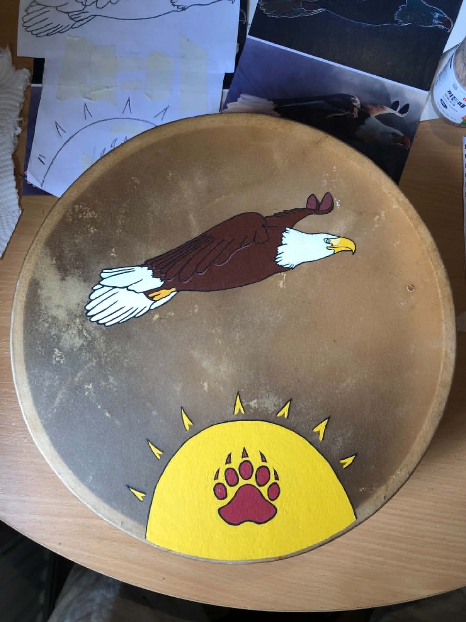
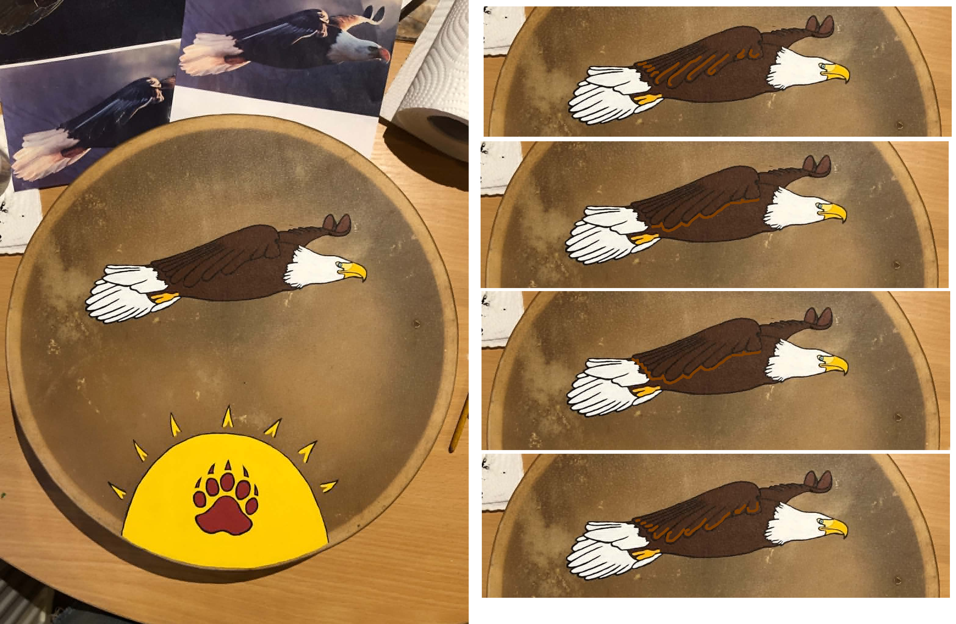
So, very quickly, the design built in my head. It needed to be connected to my Spirit name, The Eagle who Flies through the Heaven, so very quickly, assisted by the Ancestors, a design came of an eagle flying above the sun, with a bear paw print on the sun, and feathers hanging down from the handle strings. For the eagle, I've had an eagle poster on my wall for ages now, and have always liked that side profile of it. It's not posing, it's not perched, it's just... flying. So I made an edge-detected version of it to print (in several sizes), from which I will use to create a line drawing of the eagle for final painting. Oh, also if you want to hear it, it immediately made it into my song-a-day (YouTube).
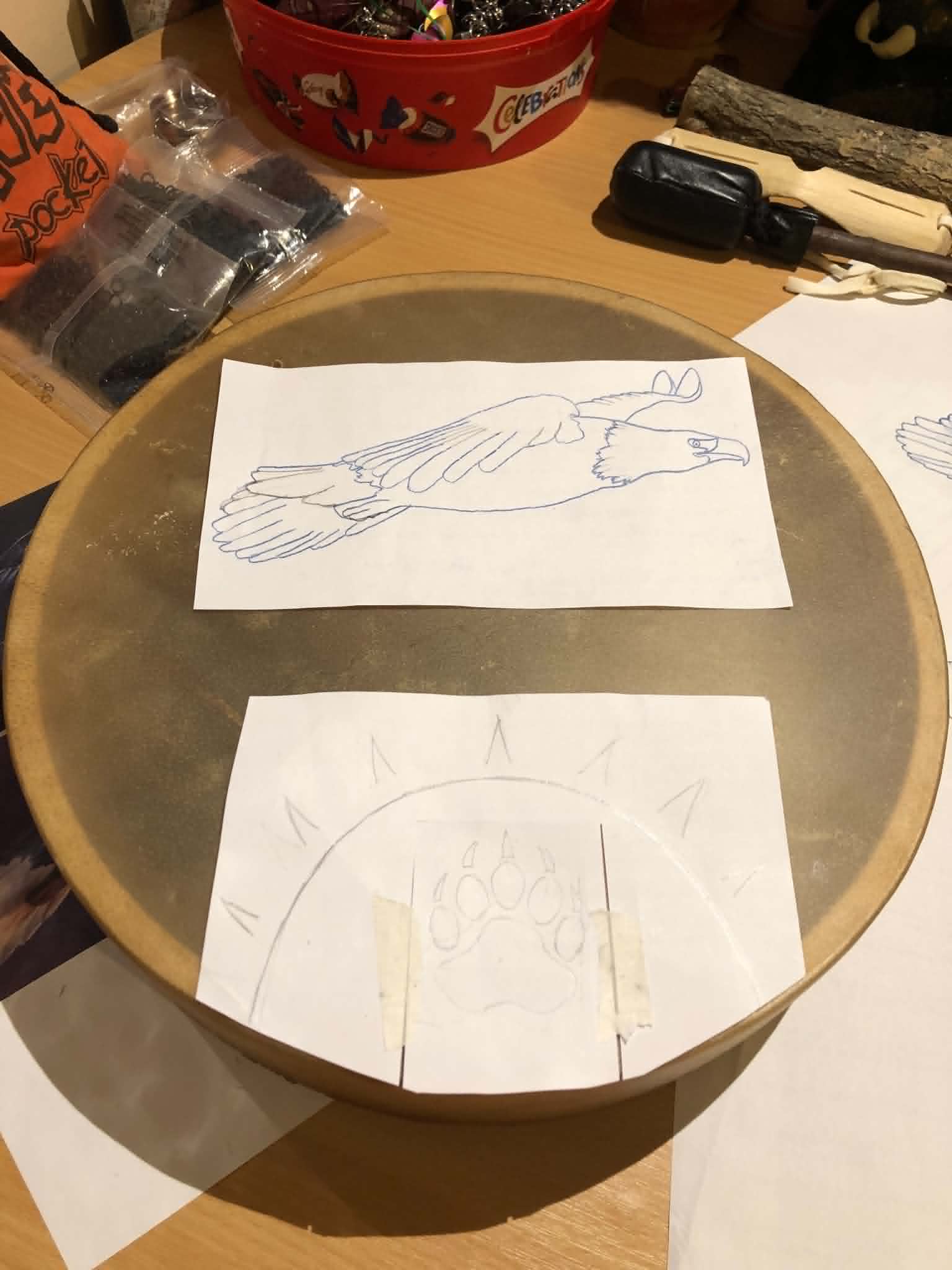
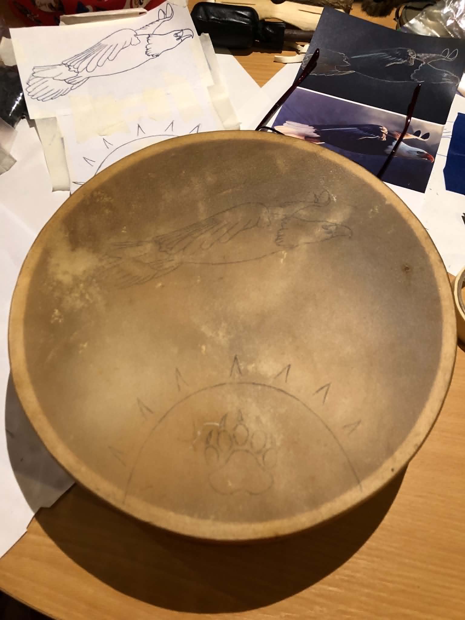
At this point came the first of the slightly stressful parts, deciding on the final design and getting it onto the drum. I picked my favoured eagle size (ended up being the biggest one printed), and sketched out about how big I figured I'd want the sun. Ended up being more or less bang-on (lol drum), so no complaints there, had to clean up the linework a smidge, and freehanded a bear paw onto it for approximate size desire. Now, it was time for carbon paper.
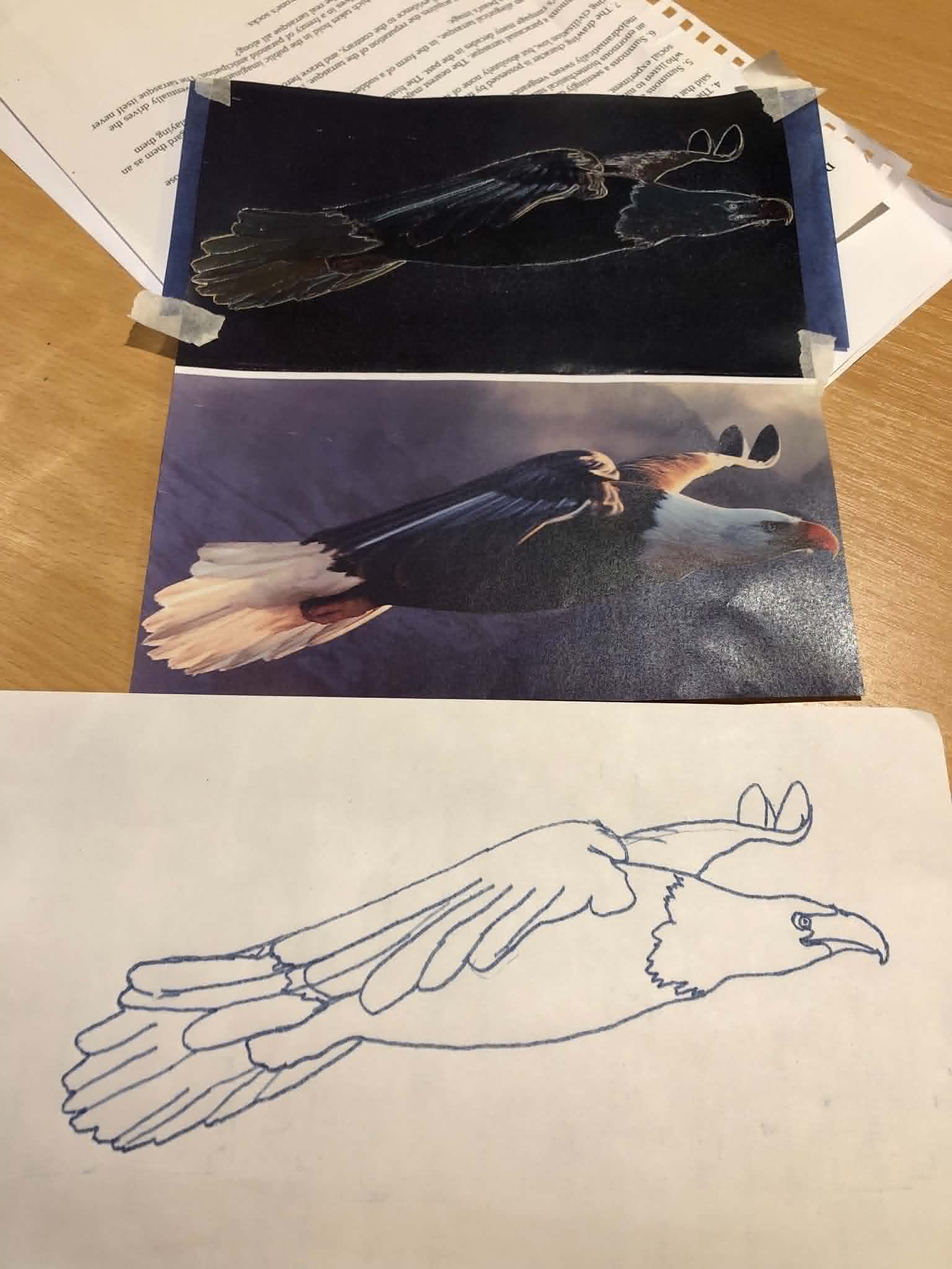
Now, because real life doesn't have crisp, clear lines around everything, I ended up having to trace the eagle three or four times before nailing it down how I wanted. I had to simplify it some, made a few mistakes here and there (are those wing feathers or part of the tail?!? Looking up pictures of bald eagles online helped with that), and eventually nailed down the lines I wanted and sorted out the wing and tail and feet questions. Also the beak in that first stencil was off, thank you again online photos.
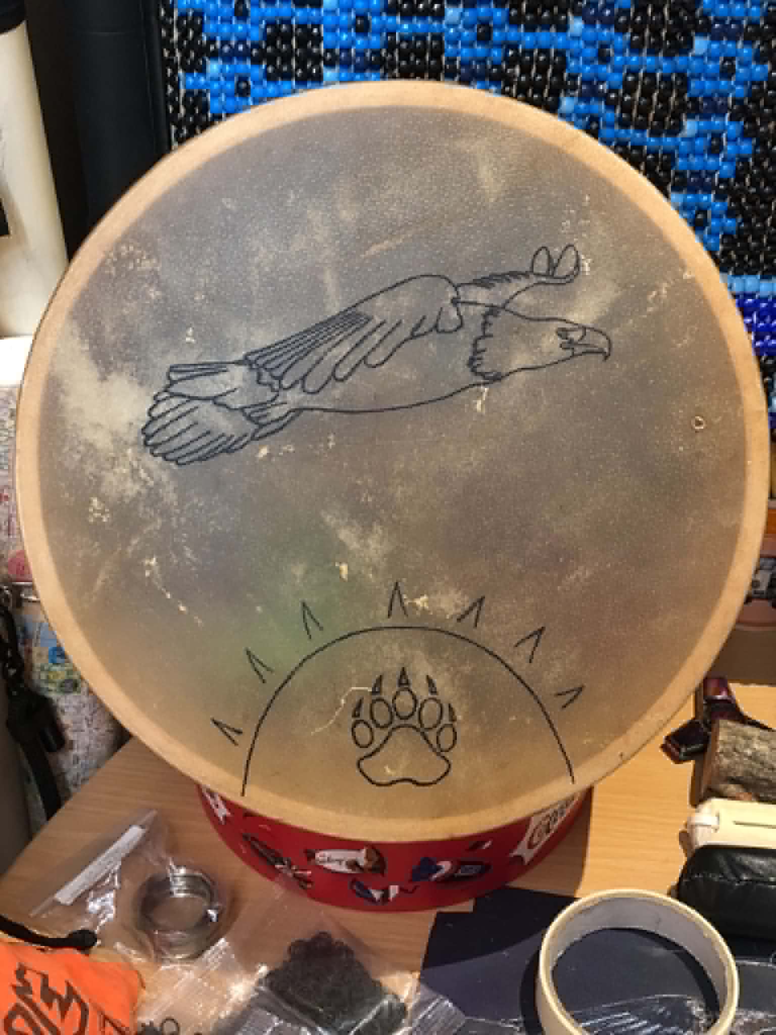
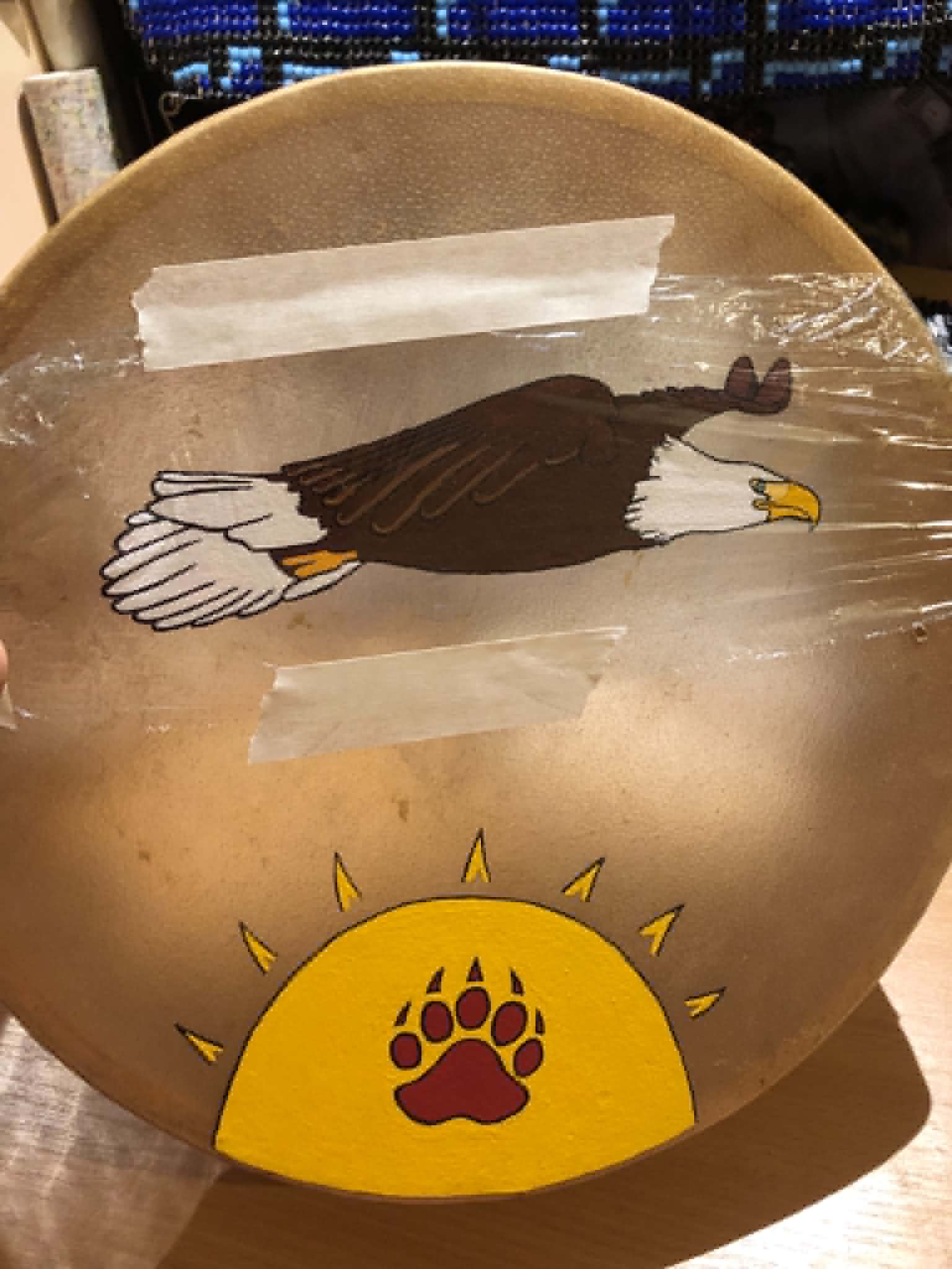
And then came the sun. We refined the linework and sun rays, and found a bear paw stencil online to trace out and modify to fit my liking. I did try to get it in the center of the sun, but it was off by like... a millimeter, so I cut it out, shaved off a mil from the one side, and taped it back in moved that smidge over, and it was golden. Next up was deciding how far to have the eagle above the sun, and once THAT was sorted out, taped the pieces of paper together, taped some carbon paper onto the back of it, and taped all of that onto the drum face (after meticulously deciding what side to have facing up, based on comfort of holding the handle beneath). And then came the slow, laborious process of going over all of my lines one more time, transferring the pattern to the drum. I had to go over that a few times to get it to transfer well, and now... the paint. Also a minor question as to whether to add some decorations around the rim of the drum to kinda fill in the empty space, but I won't really be able to tell that until after this part is painted. Thus...
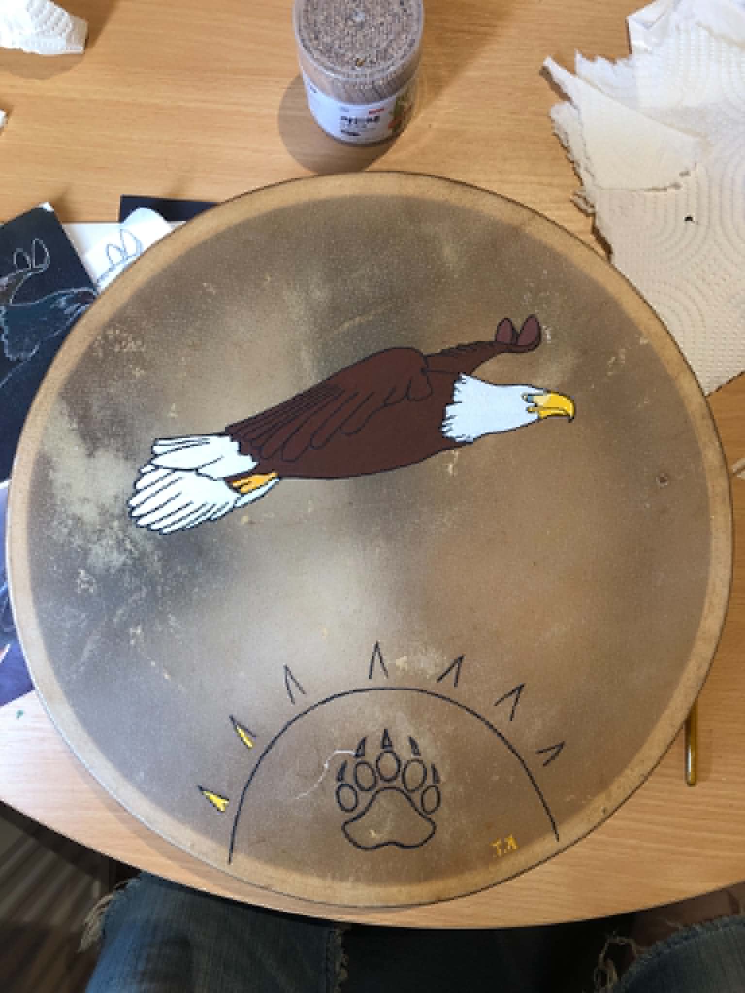
With some careful brushwork, we went over all of our carbon paper lines and got the linework down, and followed that with black paint. Which I thought would be the hard part. It kinda was, literally all of the paint is the hard part. We filled in the white, then touched up the black lines that I eked over, then did the brown. And then touched up-you get the idea, this entire process was touching up the linework between and throughout everything. Been ages since I've painted not-staves, kinda... forgot about that part.
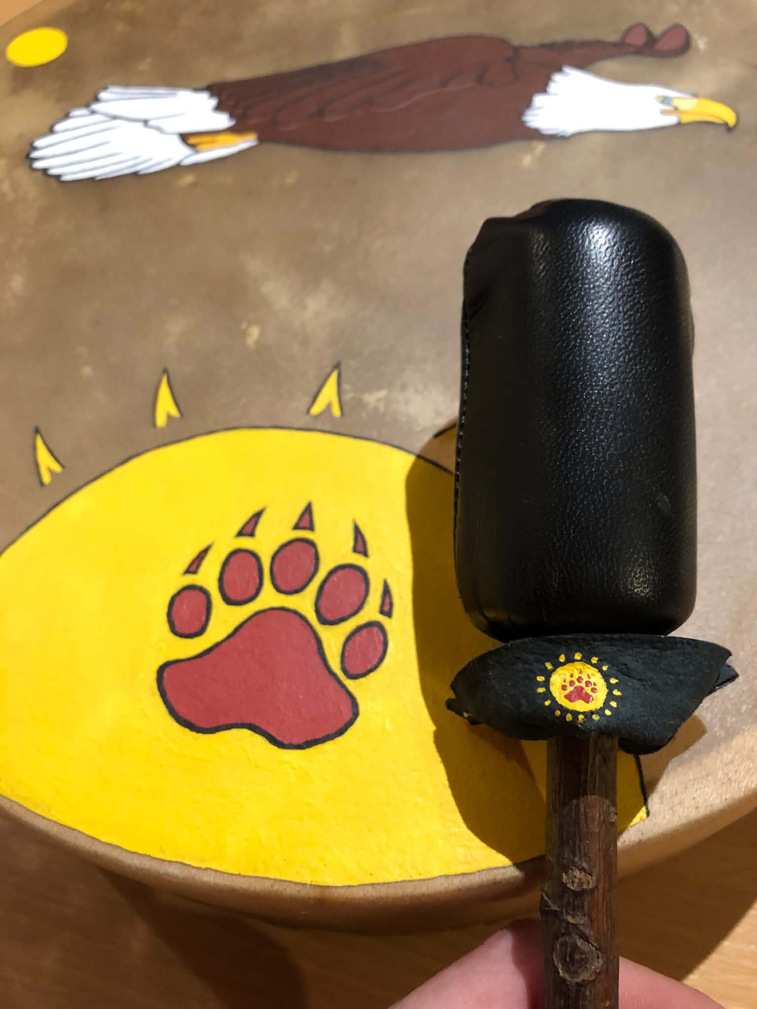
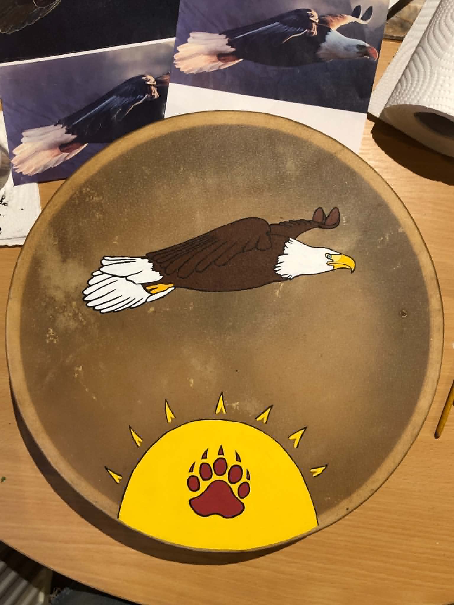
For the beak, we took just plain yellow and threw in a dash of orange, then a dose of white to that to get that kinda... spot between the eye and the beak, and a little more orange to that first beak colour to get the foot. The eye I kinda made the colour of my own eye, hazel, since it represents me. Then came the sun, just a big ol' pile of yellow. I did debate whether to fill in the triangle sun rays, but this felt nicer, leaving them kinda teepee shaped. The bear paw we took red, added a smidge of black, a touch of that eagle brown (doomslayer brown something? *checks* Doombull brown, which almost fits my aesthetic of taking scary looking things and putting them on the side of good. Also the brown that I used for the staff Bruce), and popped that into the linework.
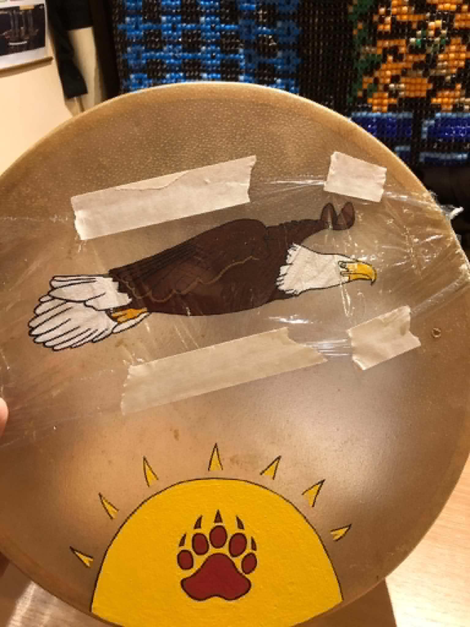
Now, that front-facing wing, that's kinda hidden in the body there. It's dark in the poster too (thus why I had such difficulties figuring that part out for the stencil), so what can I do to make you stand out more? So after asking around (I'm pretty sure it's number 4 in there, but I want to be certain) more savvy drawing artists and painters, we ended up with... a combination of 3 and 4. The spark of ingenious testing brought about by a conversation on Discord led me to test them with cling wrap. Given the sun beneath, option 4 didn't sit well with my brain, so we initially decided on option 3. The cling wrap test I did in leather brown, but on the drum it was painted in lighter deathmage1000, or whatever that one’s called again. And, after beginning to paint that, we ended up with a bit of a combination between the two, by not making a full, solid line beneath the wing, but keeping it to the wing tips as in 3, and that fit the bill (beak?) perfectly.
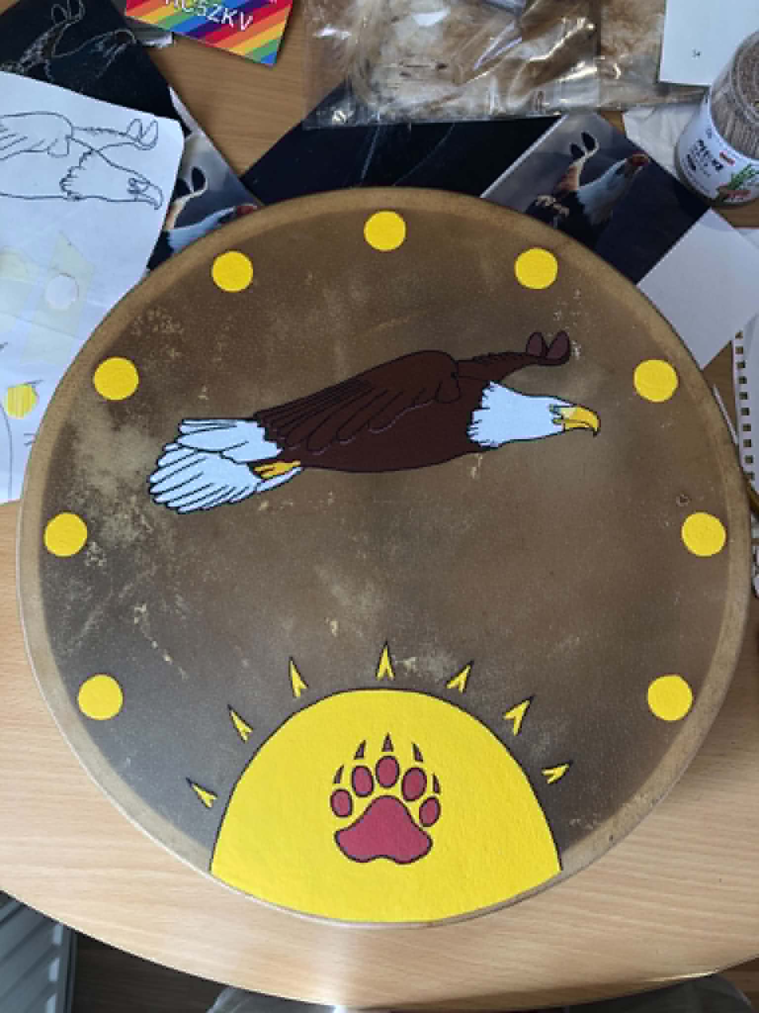
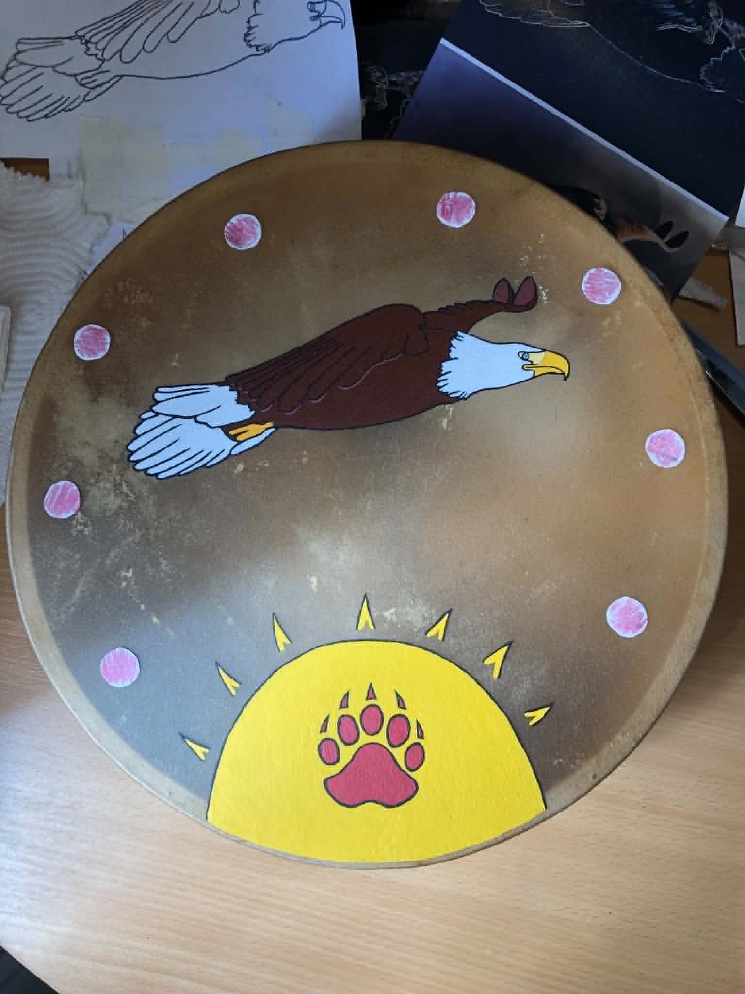
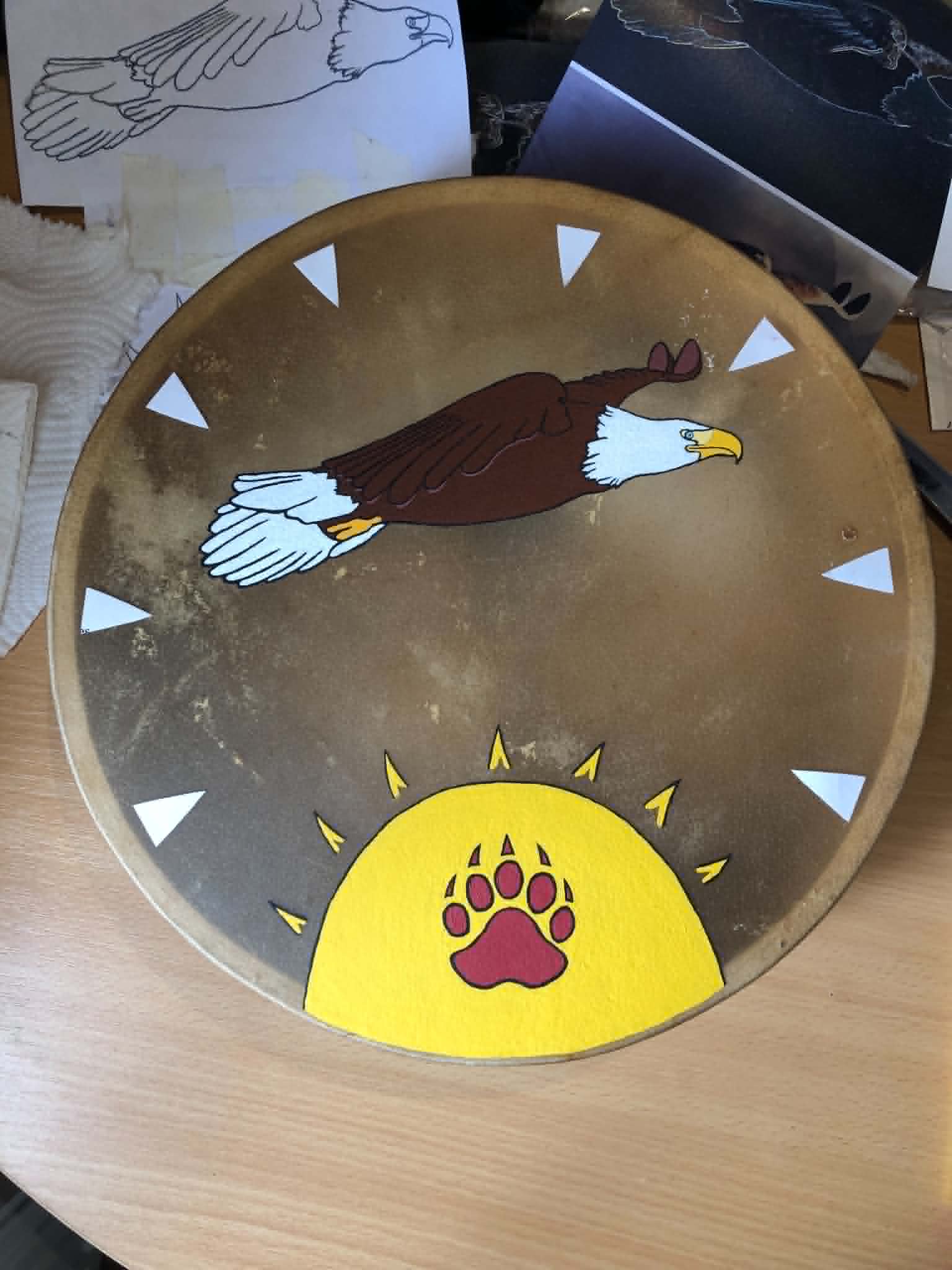
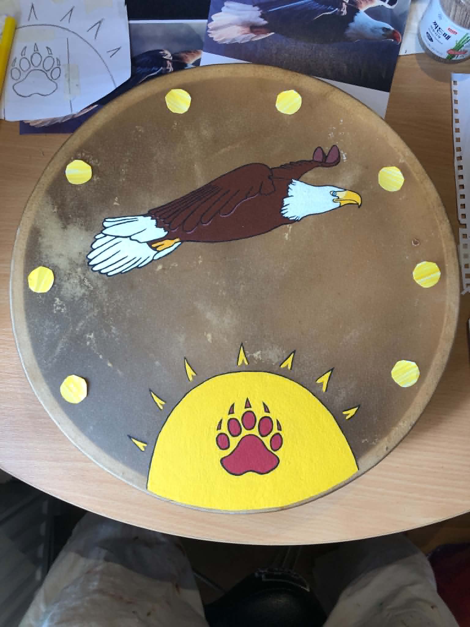
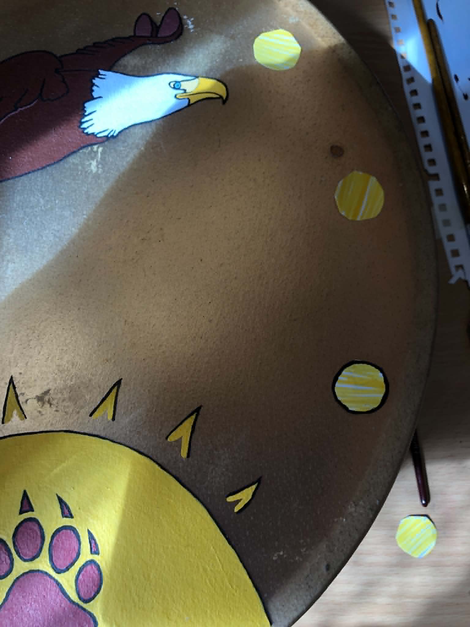
Now, how to fill out the kinda emptiness around the rim of the drum. We once again did several tests, initially thinking of red circles to match with the bear paw, and then compared against triangles because the design of that in my head just looked pretty nice. However, I rejected the red dots for being too dark, and the triangles for feeling like they're trapping the eagle inside a circle, which obviously didn't fit, and then the idea to make the circles yellow dawned (lol) on me! I am The Eagle who Flies through the Heaven, the one who speaks with all Deities. What could make sense more than an eagle flying amongst a variety of suns, for all of the Deities! With that decided, we also dabbled with outlining the circles, but quickly rejected that idea, just open suns for the smaller circles looked best.
Now, it gets a little bit interesting here, because obviously I was initially pondering 8 dots (and even debating between 7 and 8 (YouTube), but inadvertantly while trying to get all of the dots equidistant from eachother, made 9 dots, not even realizing it until I was literally half done fully painting them. Now, though 8 happened to be my favourite number, that number of dots wasn't chosen for that reason, it was just 'eh, that's good looking spacing'. Now, having done 9, I've gotta say, I like that a lot more. The 7 was too sparse, but between 8 and 9, I really like that there's a circle directly above the bottom sun, it just feels better, without being sparse. The spacing is still optimal, and when I was cutting out the test circles, I had initially made 9, but then scrapped one because at the moment I was set on 8. So it was meant to be it would seem, no complaints.
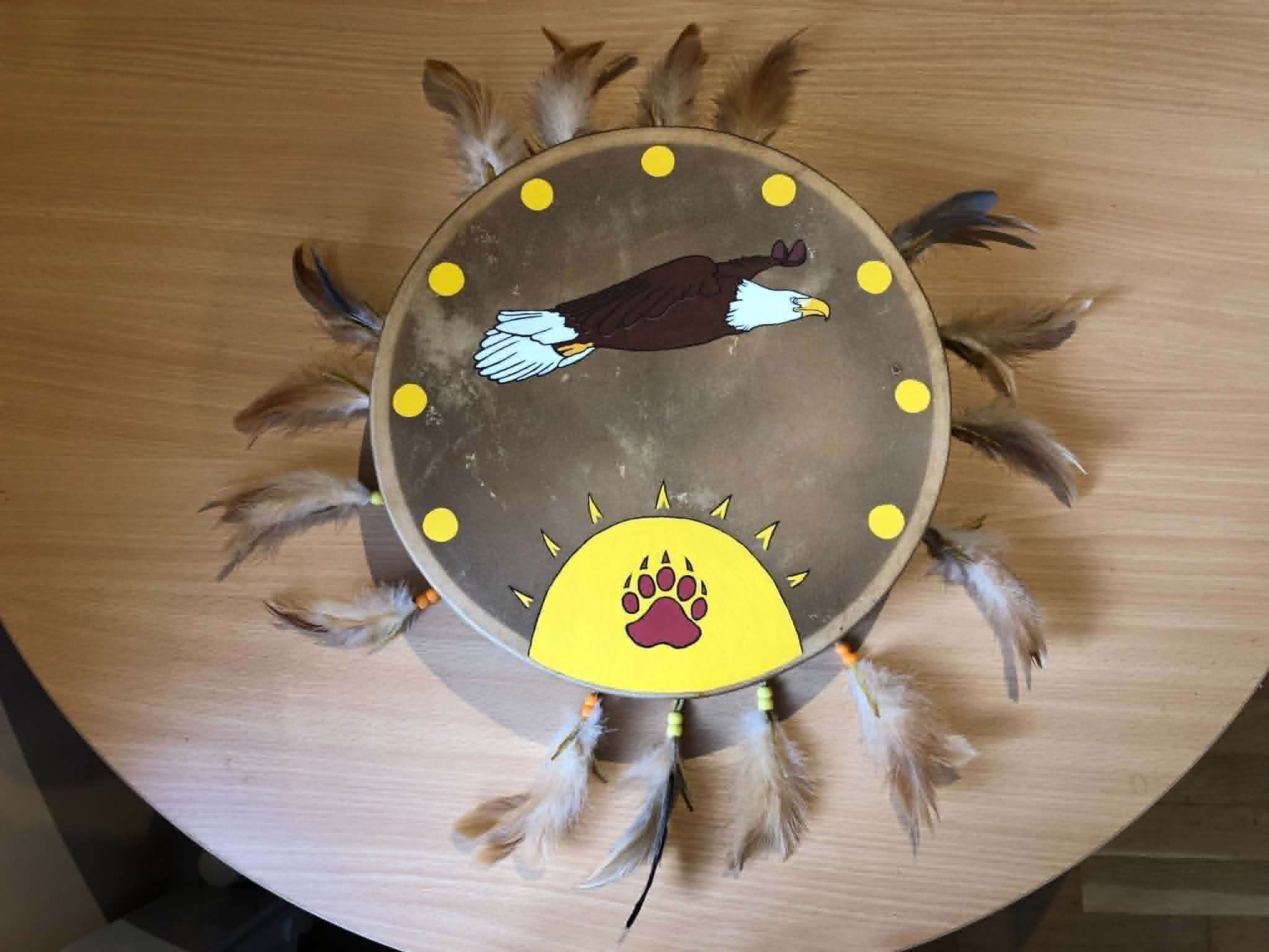
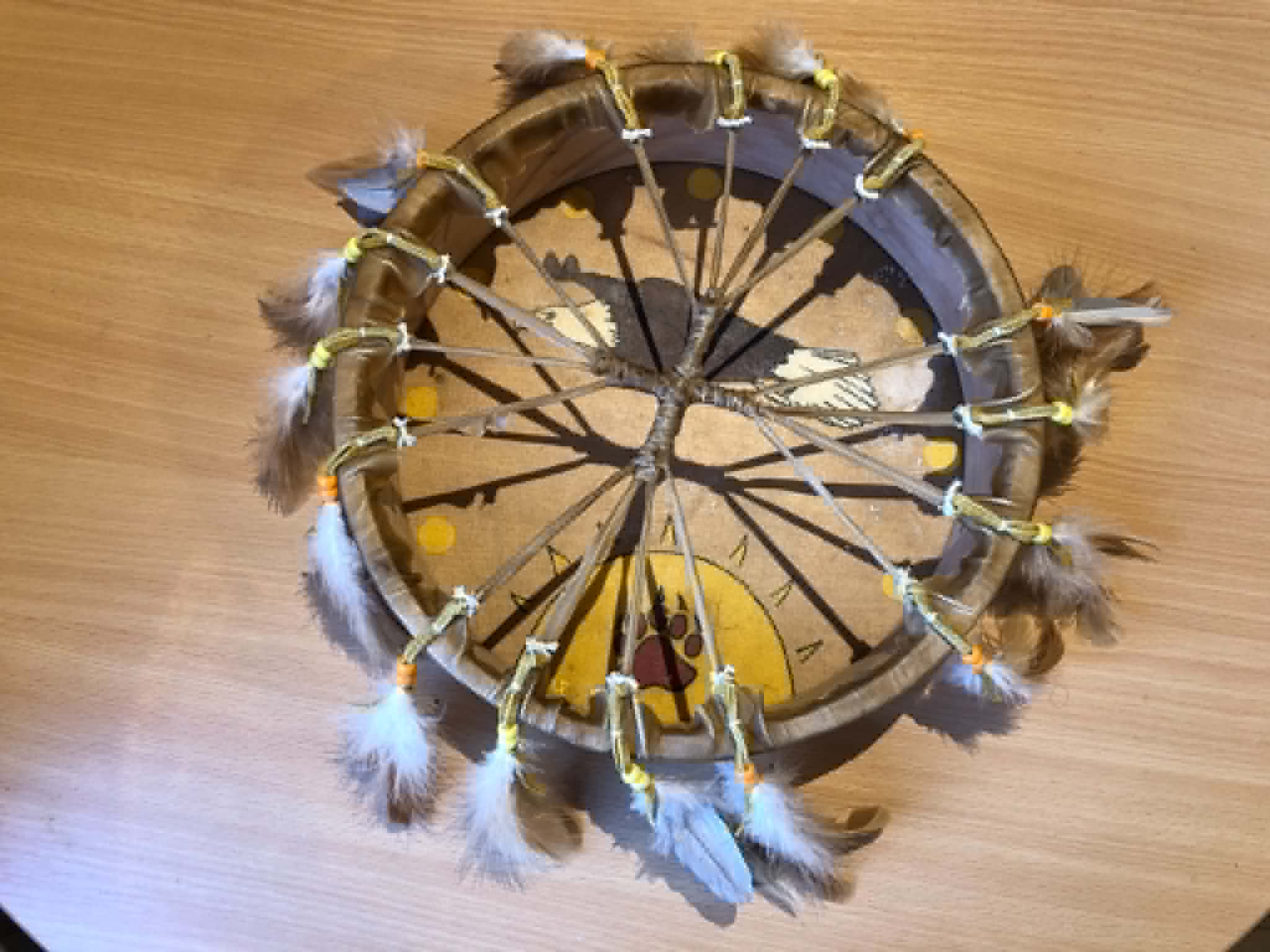
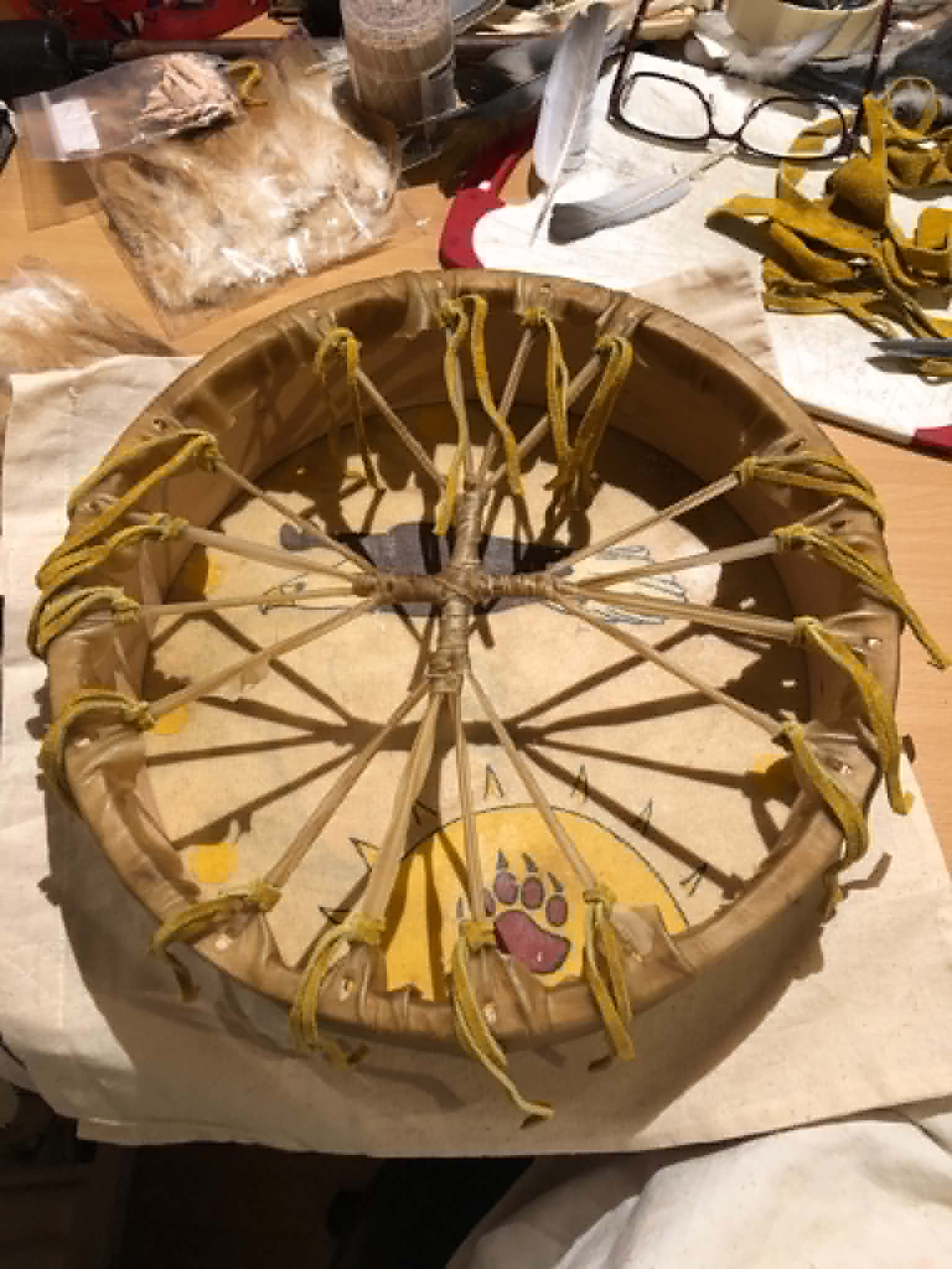
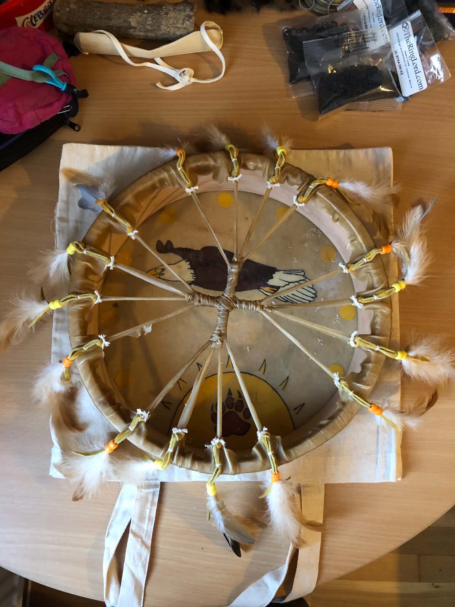
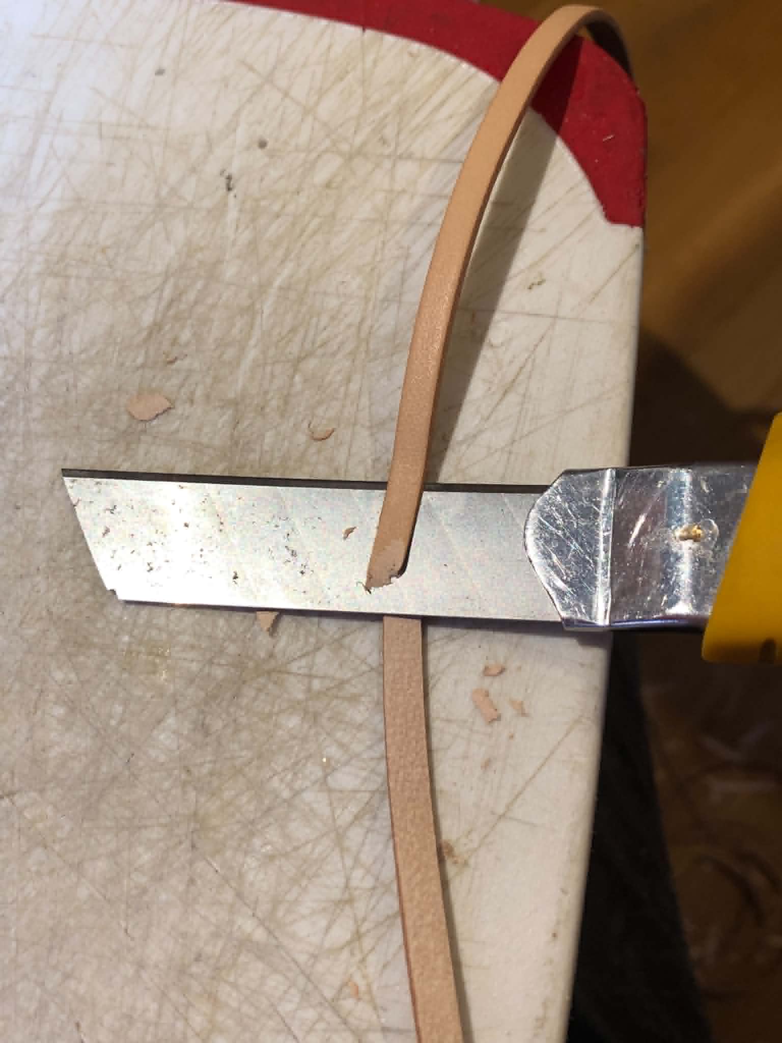
And with the painting completely done, it was time for the feather fringes. Now, I had originally ordered some leather stripping online, however when it showed up it was too rigid and thick, I could barely get a single strand through a bead, let alone two with feather quills. I attempted to shave down the leather, followed by stretching it thinner after soaking it, but that was just fruitless. Aaaaand then I checked my leather scraps, and there was figuratively a ton of it in there. Soooo, I found one good scrap that happened to be almost exactly 3 feet long stretched (12 inches stretched was an almost perfect length for my attachment method), that looked like it was meant to be a seam of a shirt maybe? Something with a few buttonholes in it, which we worked around nicely because we were making thin strips, and we just nicely got all 16 strips out of that same piece, and the doubled strip fit just perfectly through a pony bead, just... nice. Shucks to that other leather, but we've got this now, and that other stuff is sitting with the leather scraps in exchange. So that change made, we went to step 2 of our "how to make the feathers hang close to the rim" plan. Now, since the holes where the head is pulled taut are way too small for the leather, we opted for some good ol' white poly cotton blend string to go through those. Even jute string would have been way too thick to get through there, and I balked at using fishing line, fearing it would be too sharp. This feels more natural too at least, and would scratch less. So anyway, the leather strips were attached around the rawhide thongs in a good ol' lark's head knot, and drawn close the the rim with the string, which looped under and up again to knot at the knot, so to speak. A square knot followed by a dot of gorilla wood glue and a final square knot on top of that to keep anything from untying later, and we trimmed all the string neat. After that I kinda shopped the bead patterns around a bit, opting for an orange yellow yellow orange approach to each set of four. And with that in place, we were ready for the feathers, where things get a bit messier/more interesting.
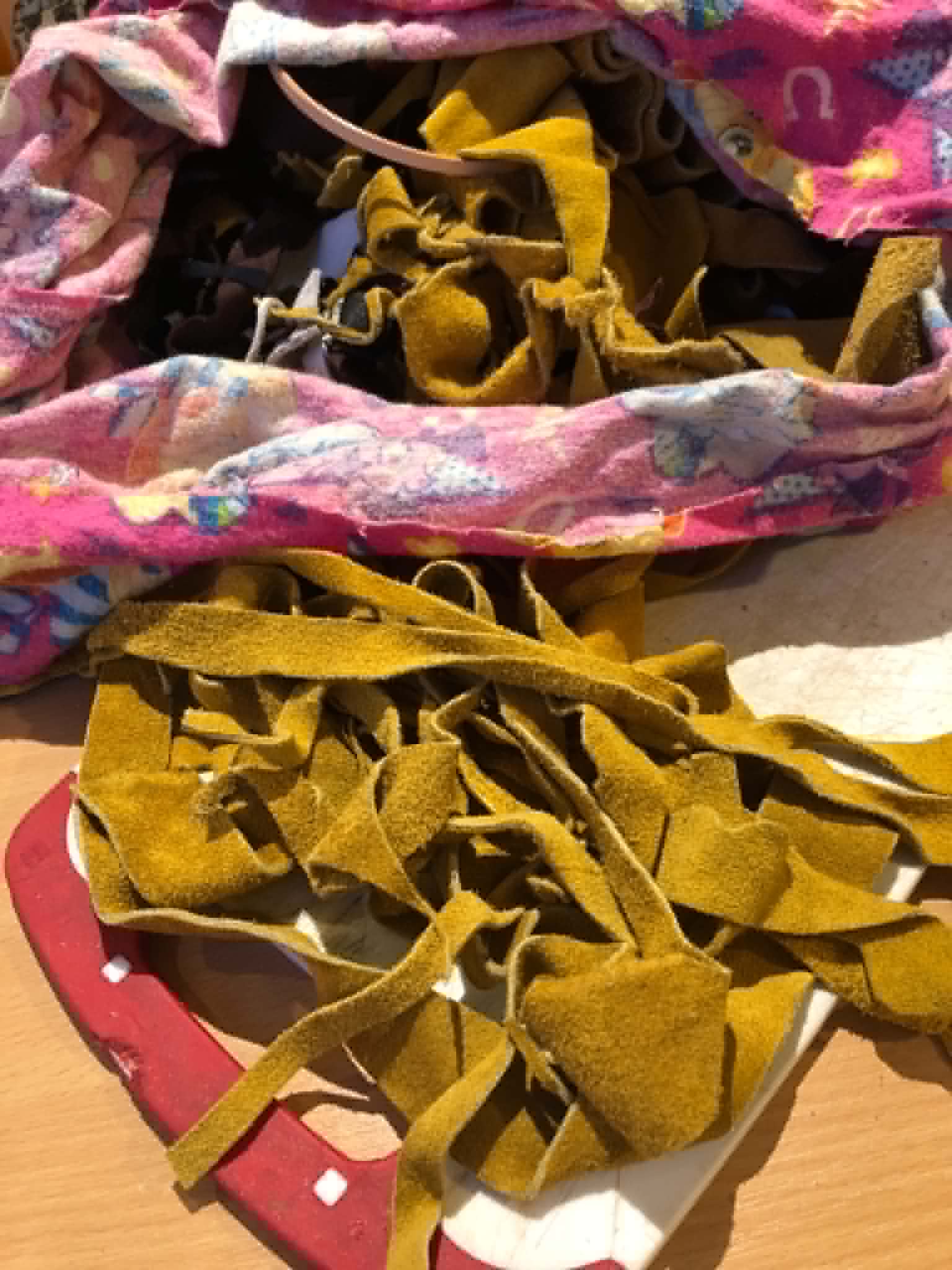
So, we wanted three sets of pigeon feathers, one with a crow feather in it to represent myself, and with sixteen connection points, that makes it a bit tricky. But, with the connection points not perfectly exact from eachother, we found three points within a centimeter of equidistant, one to either side and one facing towards me, which would contain the crow feather. With that decided, we pulled one of the double-beads up to the rim, pulled out the pile of brown chicken feathers that we got online, and began finding sets of three (a good looking bundle, not too sparse, not too full, 3 is a good number) that were approximately the same length to go with each set of leather fringes. One by one, we slipped the lower bead up a bit, put the feather quills between the two strands of leather, and pulled the bead down over them, sandwiching the feathers in until about 3mm of the quills were showing above that bead, added a drop of glue, and slipped down the upper bead overtop of those, fully sandwiching and gluing the quills into place, making sure that it was all arranged so that exactly 22mm was between the white string and the top bead (22mm just looked like a good distance so I ran with it, just... made sure all of them were the same). I had marked the points at which I wanted to add the pigeon feathers, so I dutifully grabbed them each time I got to that point and added two pigeon feathers and one chicken feather (to blend the colours all together a bit better), and at the bottom there, added one chicken, one pigeon, and one crow feather. To be more specific, I picked and placed all of the feathers into the first bead to begin with (I had one example feather set aside to measure all the others to), then one by one went around, added a drop of glue to the quills sticking through, and put the top bead down over that to glue them all tightly together. And as one final step, I went and made all the leather fringes the same length, 37mm (which again just looked good, so I ran with it), and after cut the tips of all of the fringes at an angle in the same direction to taper them all to a point.
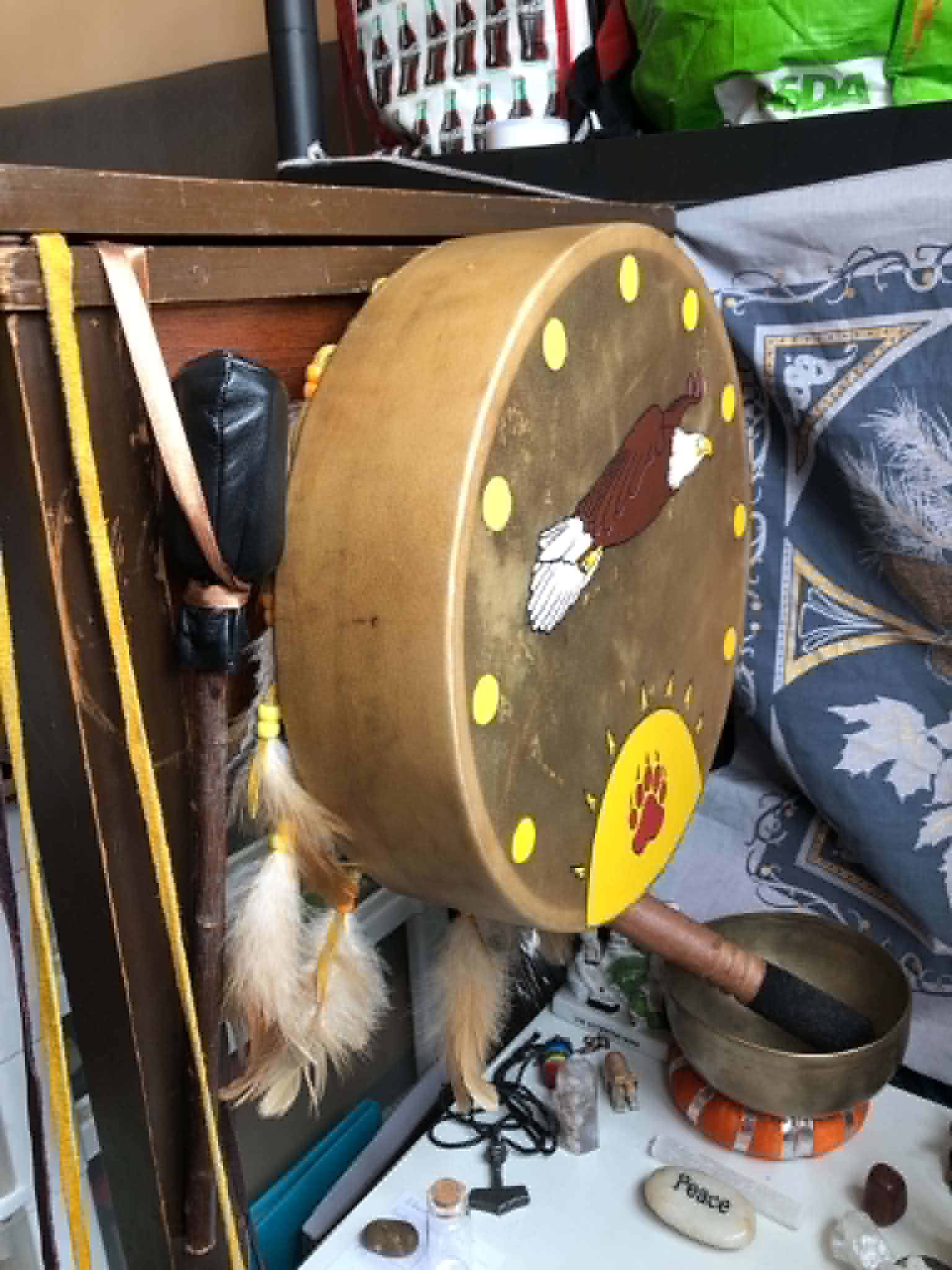
I debated for a minute whether to paint something on the drumstick to kinda pair them, a bear paw perhaps, but didn't want to draw undue attention to the drumstick... which led me to take the best of both worlds, painting a tiny sun with a bear paw on the underside of the leather. Epic.
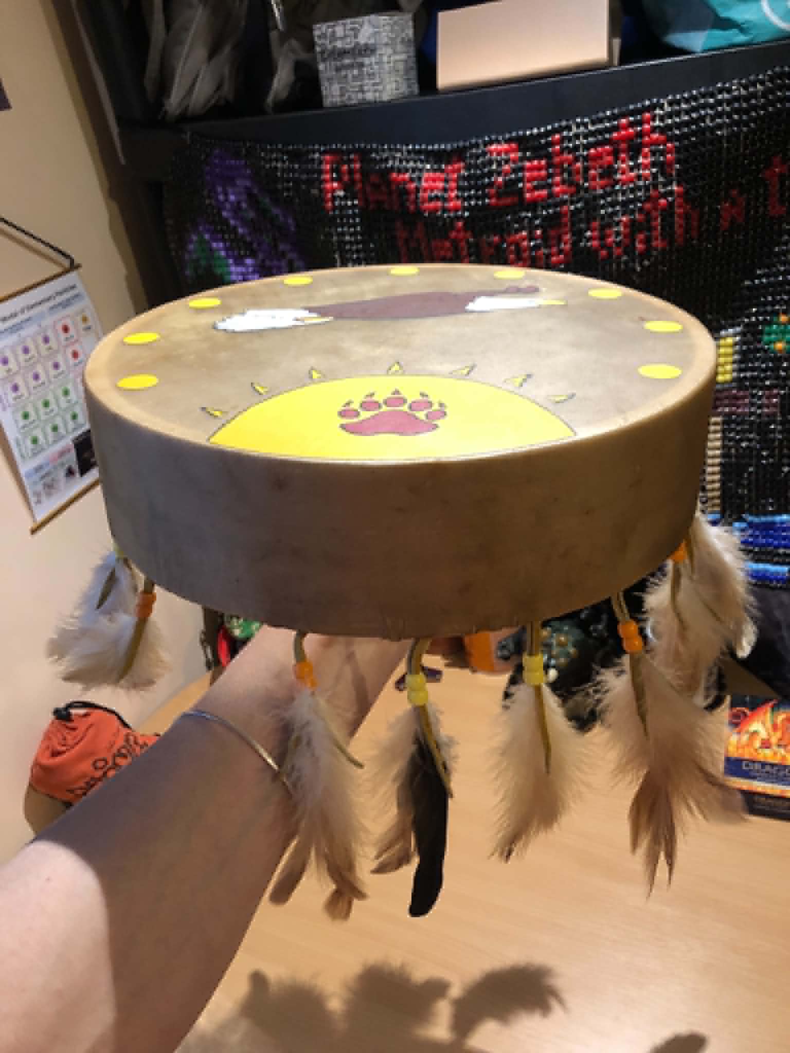
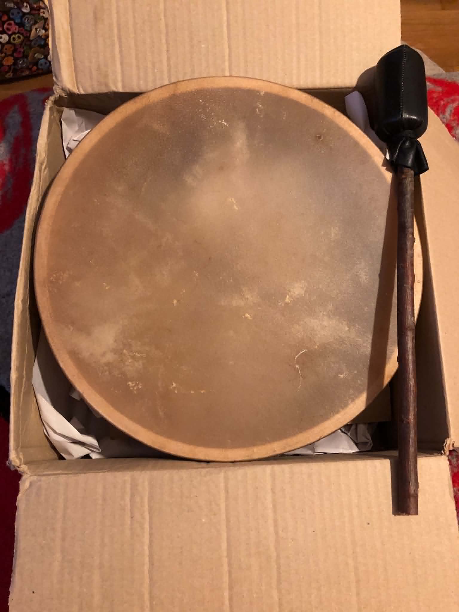
And with that, our ceremonial Cree drum is complete! Feathers, fringes, drum and drumstick, I'm so happy with how everything came out. The eagle is so sharp and clear, the suns are evenly spaced and the same size, the bear paws look amazing, I'm so happy. I was sending pics of this thing to like everybody that I know, including people I haven't messaged for years. Thank you Ancestors, I'm in love with this thing. Miigwech ❤️ 🙏
Finished June 2, 2026
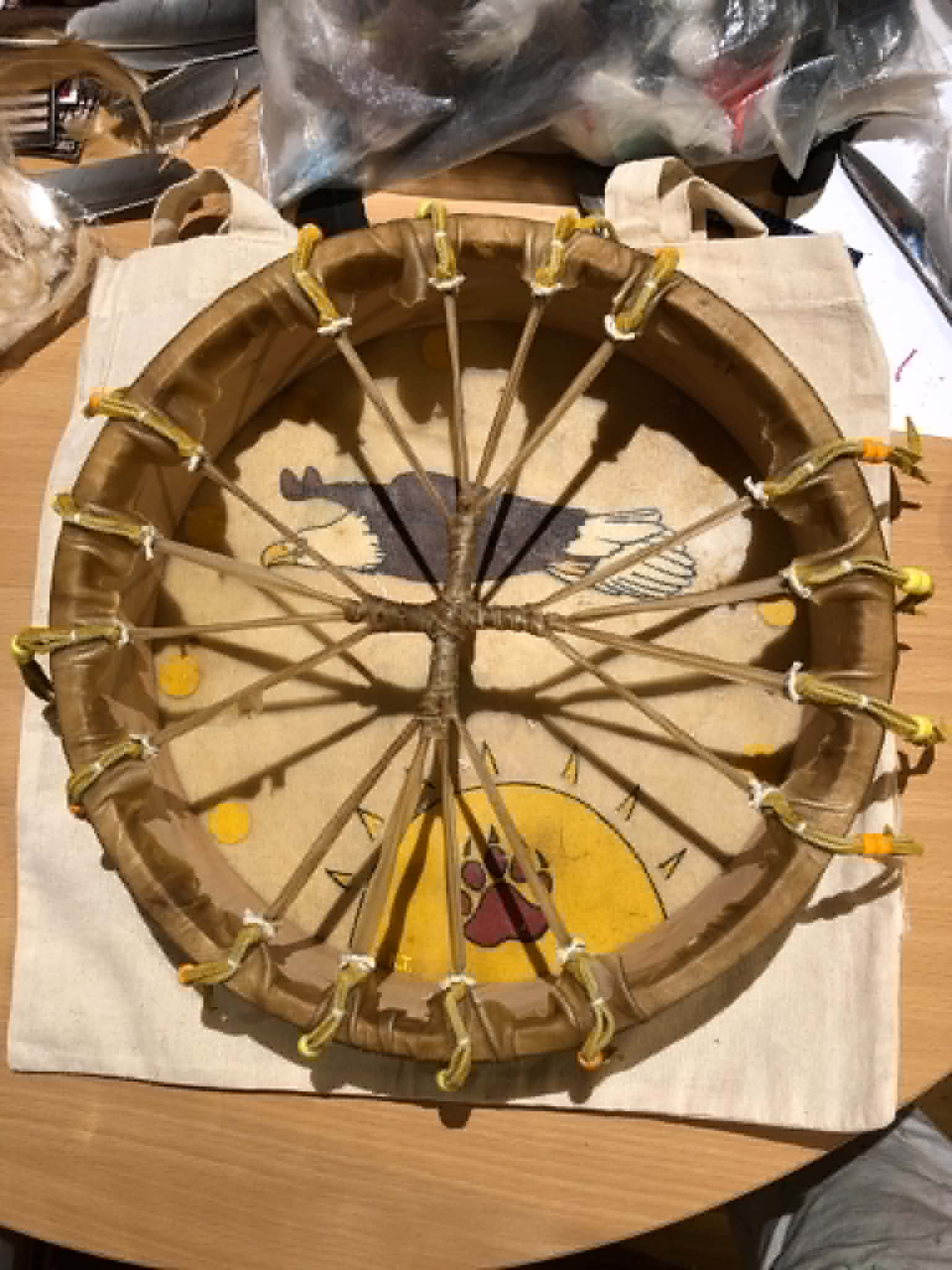
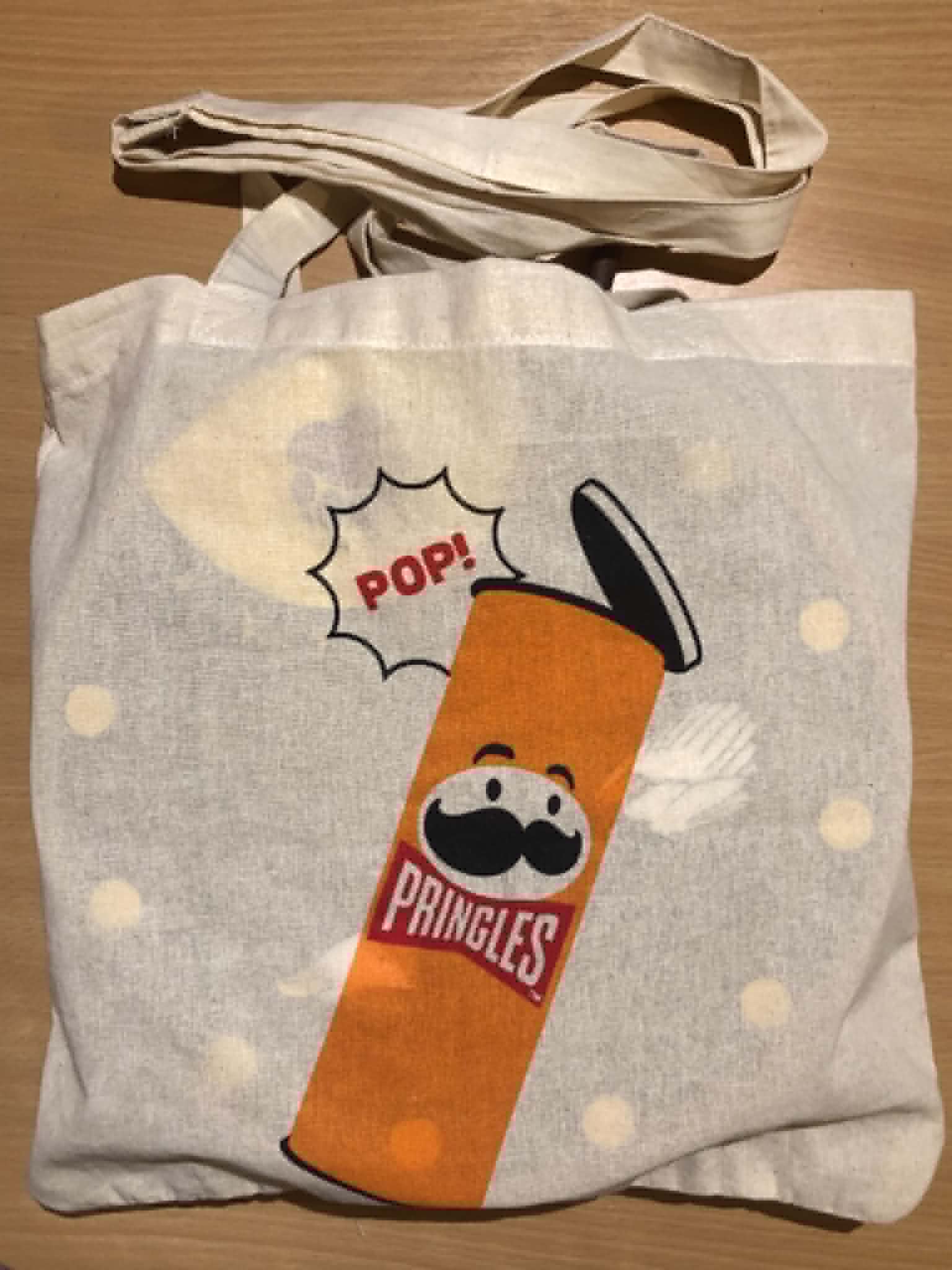
EDIT: And as one more added bonus, we made a carry bag for the drum to take it to ceremonies and events!
